Esri UC25
Bold Visuals, Engaging Spaces:
Designs That Drew a Crowd
Contributed custom illustrations and designed dynamic kiosks and special displays for Esri’s User Conference, one of the largest conferences in Southern California, second only to Comic-Con, transforming complex GIS concepts into immersive visual experiences that engaged thousands of attendees.

Client
Esri
Windmasters, Fabric Special Display, Agency Kiosks, Cart License Plates, & Social Graphics

Food Trucks
Serving up Design that Delivers:
At Esri’s User Conference in San Diego, a custom-designed double-sided food truck windmaster became more than signage; it became a landmark. The bold graphics helped guide 20,000+ attendees to recharge with food, fun, and flavor between sessions.

Client
Esri
Layout, Typography Design, & Illustration

Case Study:
For Esri’s User Conference in San Diego, I designed a double-sided windmaster for one of the onsite food truck activations, creating large-format graphics that blended wayfinding with bold visual branding. This sign was located in a high traffic area and effectively pointed consumers to food trucks they could select from during their small lunch break while also reminding users of Esri’s User Conference.
To maintain consistency with the conference’s overall look and feel, I used the User Conference key art as the foundation for the design. I adapted the established color palette and graphic elements, then layered in high-contrast typography and playful composition to make the signage stand out in a crowded outdoor space.
The result was a vibrant, double sided display that transformed the food truck into a recognizable destination, drawing tens of thousands of attendees and turning a routine lunch break into an engaging, on-brand experience. The design served both practical and creative goals: guiding guests to the food area while extending the conference’s visual identity into an unexpected. photo-worthy moment.
Qatar CGIS Special Display
Breaking New Ground:
First Intern and First Female to Design a Special Display for Qatar
As the first intern and first female ever entrusted with designing a featured Special Display for the country of Qatar at Esri’s User Conference, I brought Qatar’s GIS leadership to life. My high-impact installation spotlighted smart cities, AI, and digital twins; drawing thousands to the Learning Zone and positioning Qatar’s innovations at the center of the global GIS stage.

Client
Qatar
Layout, Typography Design, & Illustration


Case Study:
At Esri’s 2025 User Conference, I was selected as the first intern and female entrusted with designing a featured Special Display for the Country of Qatar, located in the Learning Zone. Throughout the project, communication with the client was challenging due to the time difference, and the files provided did not meet print production standards (including links being missing within the files they sent over). As a result, I reconfigured and rebuilt multiple assets to ensure they printed correctly and aligned with the display’s dimensional requirements.
The display highlighted Qatar’s cutting-edge GIS initiatives, including smart city development, AI integration, digital twin technology, and 3D modeling. I developed a clean, bold visual system using vibrant color and modern typography to stand out within the fast-paced conference environment. The final cube design translated complex technological concepts into an accessible visual experience, attracting thousands of visitors and elevating Qatar’s presence on the global GIS stage.
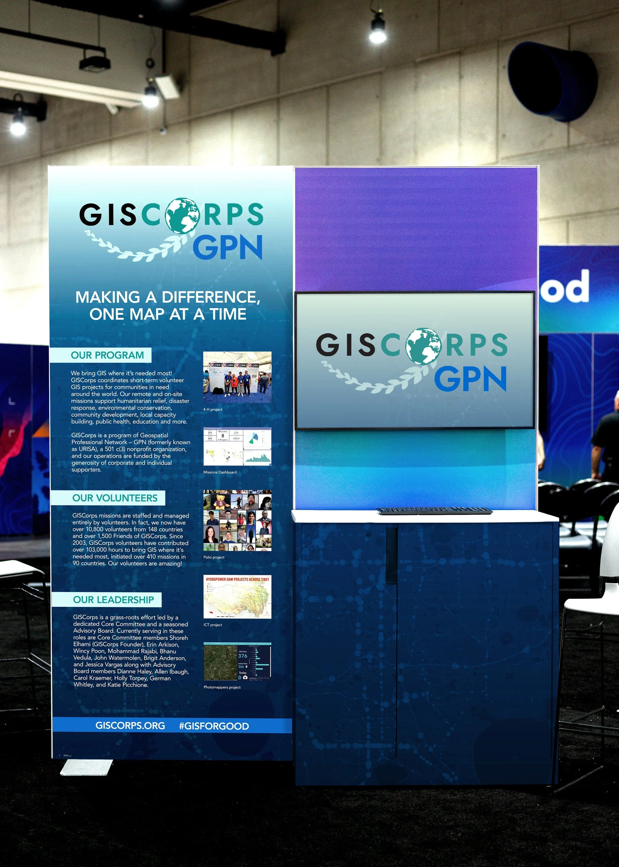
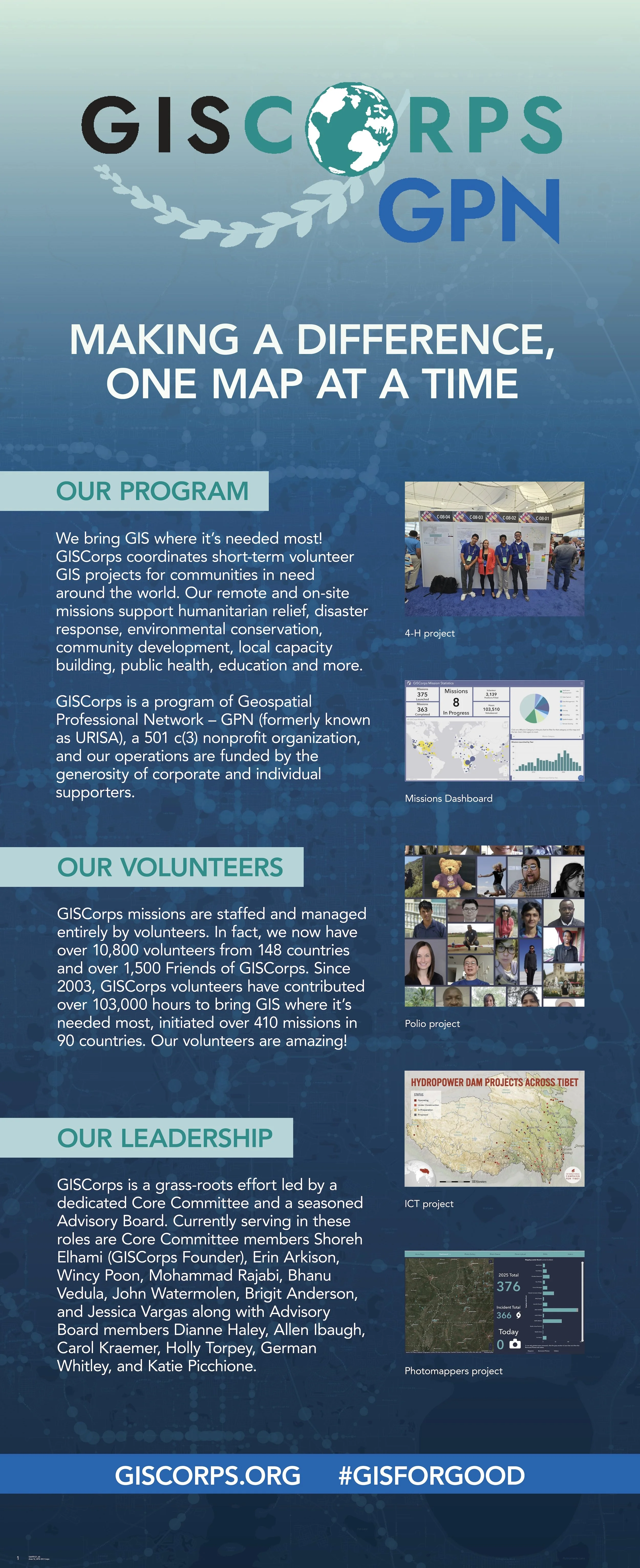
Agency Kiosks
I had the opportunity to design standout kiosks for GISCorps, the GIS Professional Network, and the Society for Conservation GIS, each tailored to reflect how these groups use GIS to make a global impact. From mobilizing volunteers to championing conservation, I transformed each mission into a visual experience that drew attention, sparked conversation, and stood out in one of the conference’s most visited spaces.
Elevating the Experience:
Intern-Designed Kiosks Turn Heads at UC
Client
GISCorps GPN & Society for Conservation GIS
Layout, Typography Design, & Illustration


Case Study:
At Esri’s 2025 User Conference, I designed a set of agency kiosks for GISCorps, the GIS Professional Network (GPN), and the Society for Conservation GIS, located in the heart of the Expo Hall. These displays communicated how each organization uses GIS to serve communities, empower professionals, and support global conservation efforts.
After gathering and refining content from each client, I developed a series of clean, vibrant kiosk designs using dynamic grid systems, bold color, and modern typography. One unique challenge was incorporating the GISCorps / GPN logo, which includes multiple colors that made it difficult to place on light, dark, or midtone backgrounds while maintaining brand accuracy. To solve this, I introduced subtle gradient transitions within the layouts to create contrast behind the mark without compromising the overall design system.
Each kiosk balanced clarity with visual impact, ensuring that the organizations’ missions were easy to understand at a glance while still standing out in a high-traffic environment. The final displays attracted thousands of attendees throughout the week and helped elevate the visibility of mission-driven GIS work at one of the world’s largest geospatial conferences.
Cart License Plates
License to Lead:
Bold, Personalized Plates Created for Esri Executives
Turning names and titles into standout visuals, these custom license plates made leadership easily identifiable while adding personality to the carts used throughout the facility.

Client
Esri
Typography Design


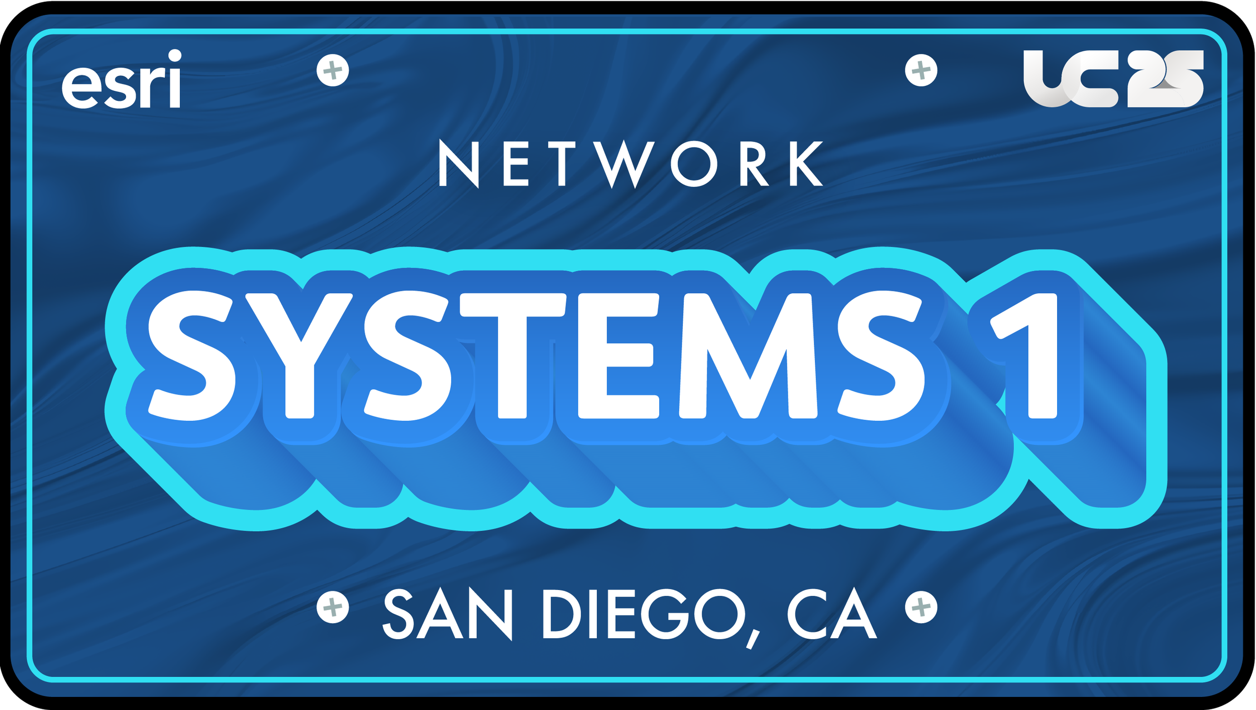

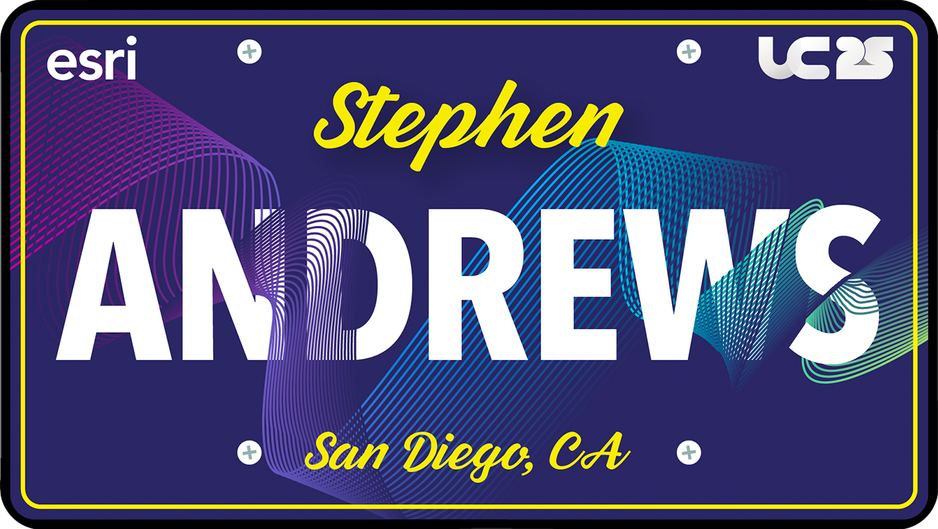

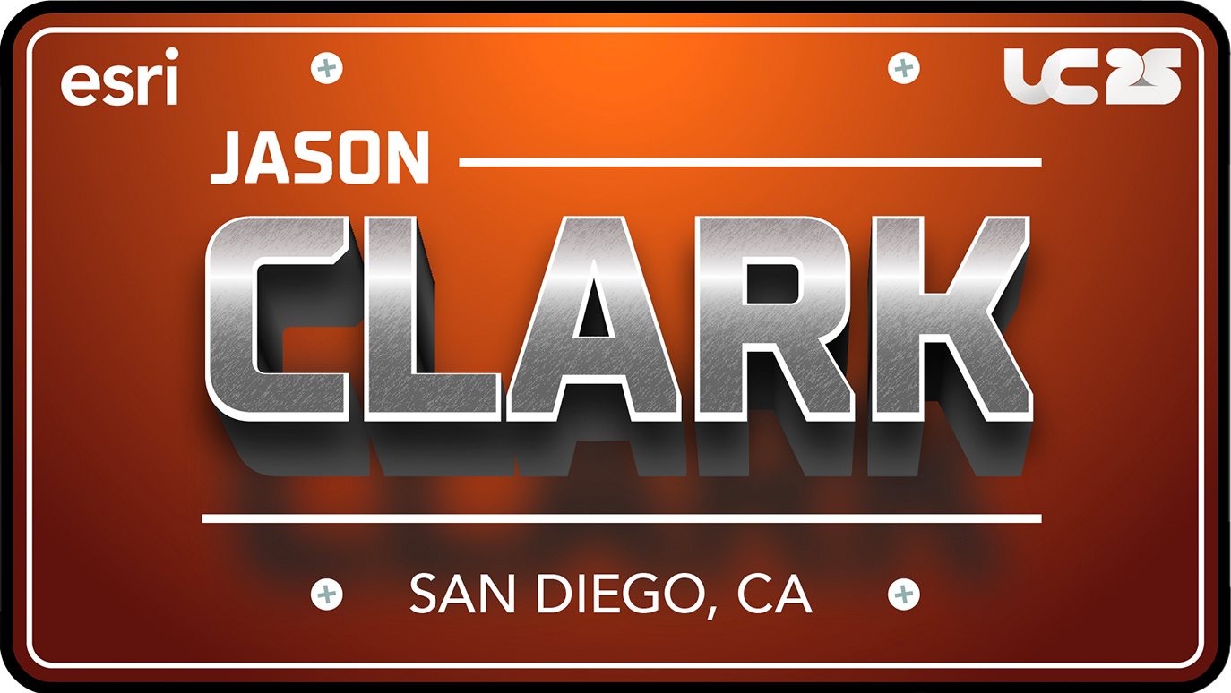
Case Study:
At Esri’s 2025 User Conference, I was tasked with creating a series of personalized license plate graphics for key leaders and executives across the company. These plates were displayed on the carts used by those leaders during the conference, serving as both name identifiers and dynamic, personalized design moments that enhanced the internal experience.
Each plate was uniquely designed to reflect the personality, role, or branding preferences of its recipient. Because this was an internal project, the designs didn’t strictly follow the UC25 visual system, allowing more creative freedom to explore a range of typographic styles, color palettes, textures, and visual effects; from sleek metallic finishes to playful gradients.
This project gave me the opportunity to experiment with expressive typography and visual treatments while still maintaining clarity and readability at a distance. By approaching each plate as its own mini design system, I ensured every piece felt bold, memorable, and tailored specifically to its owner.
The final result was a standout collection of custom graphics that blended professional branding with personal flair, giving Esri’s leadership a distinctive visual presence throughout the event.
Partner Experience Center Social Graphics
Bringing the Partner Experience to Life:
Social Graphics That Engage and Invite
Capturing the spirit of the center with eye-catching visuals that spark conversations online.

Client
Esri
Visual Hierarchy, Layout, & Composition

Case Study:
For Esri’s 2025 User Conference, I created a series of social media graphics promoting visits to the Partner Experience Center. Following Esri’s brand guidelines, I utilized a structured social media template to maintain consistency and clarity across all posts.
To align with the conference’s creative direction, I incorporated art clusters drawn from the UC visual style guide, adding dynamic visual elements that reflected the event’s unique aesthetic. This combination balanced Esri’s brand standards with the User Conference’s signature style, creating graphics that felt both cohesive and engaging.
The final pieces successfully highlighted the innovative atmosphere of the Partner Experience Center, driving higher social media engagement and encouraging attendees to visit during the conference.