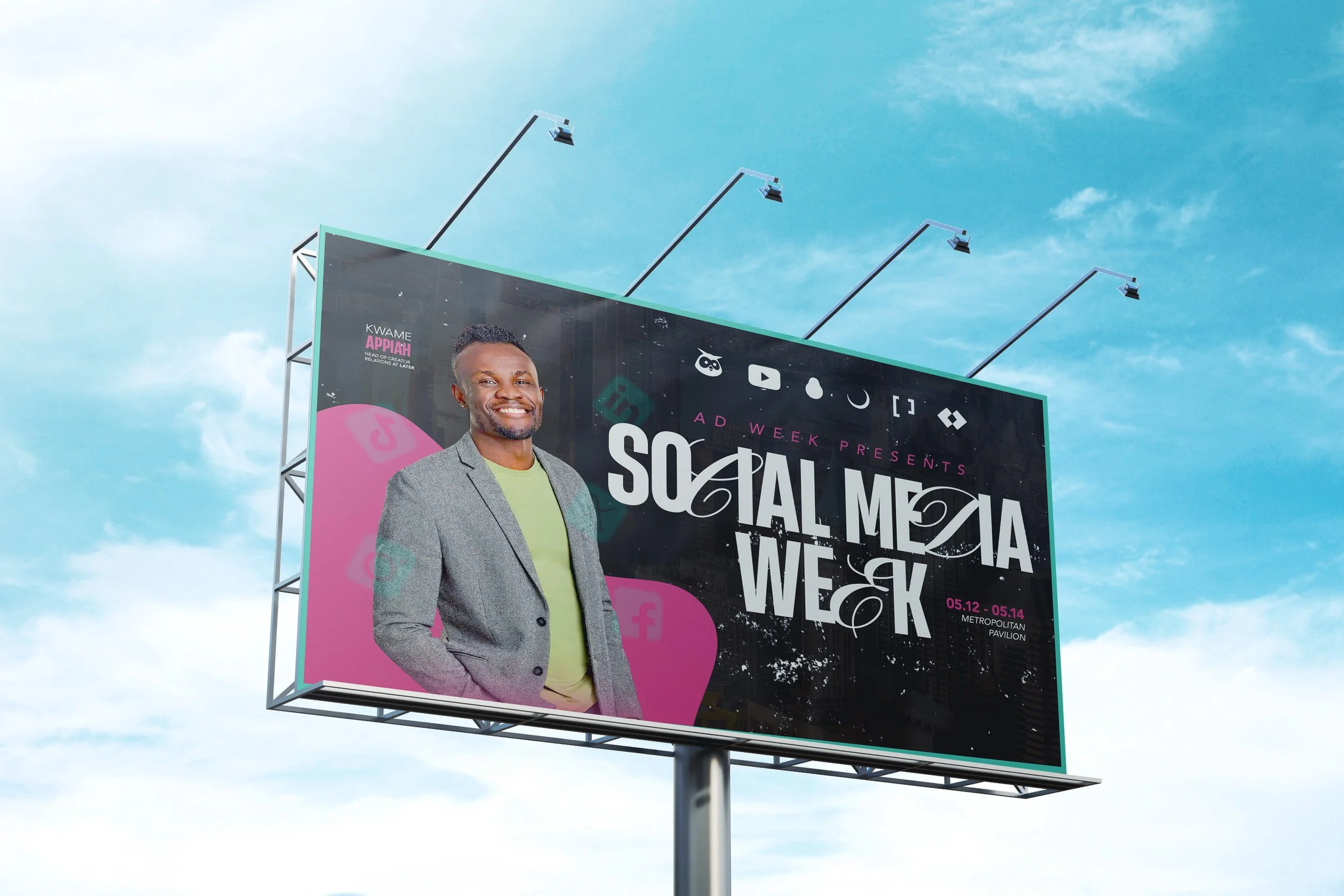
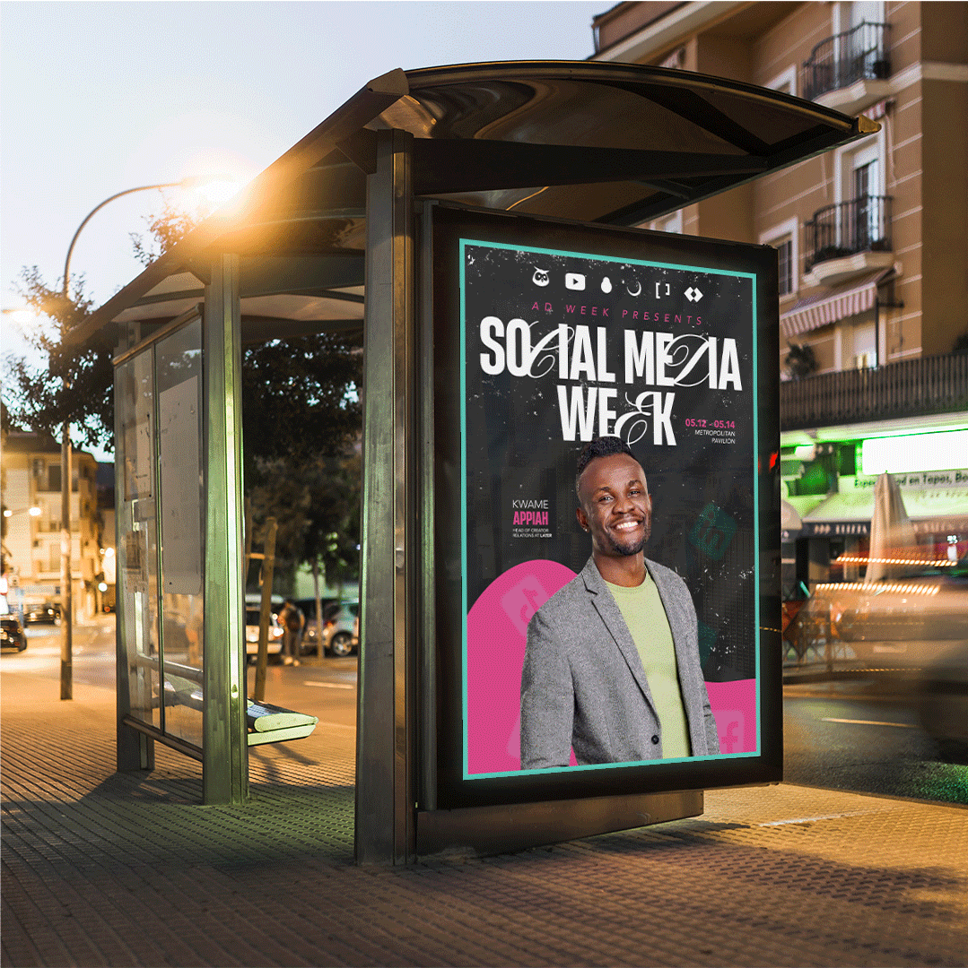
Social Media Week
Swipe, Stop, Stare:
The Design That Dominated Social Media Week
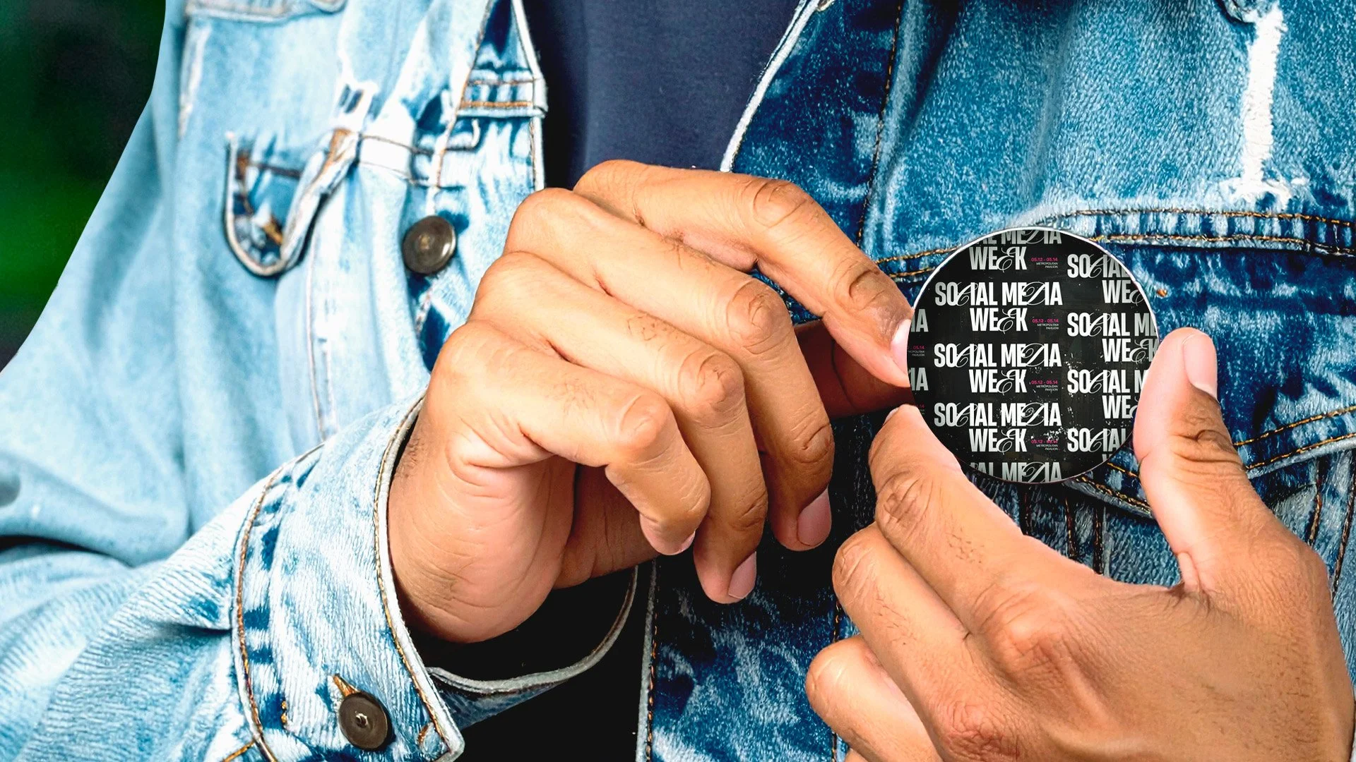
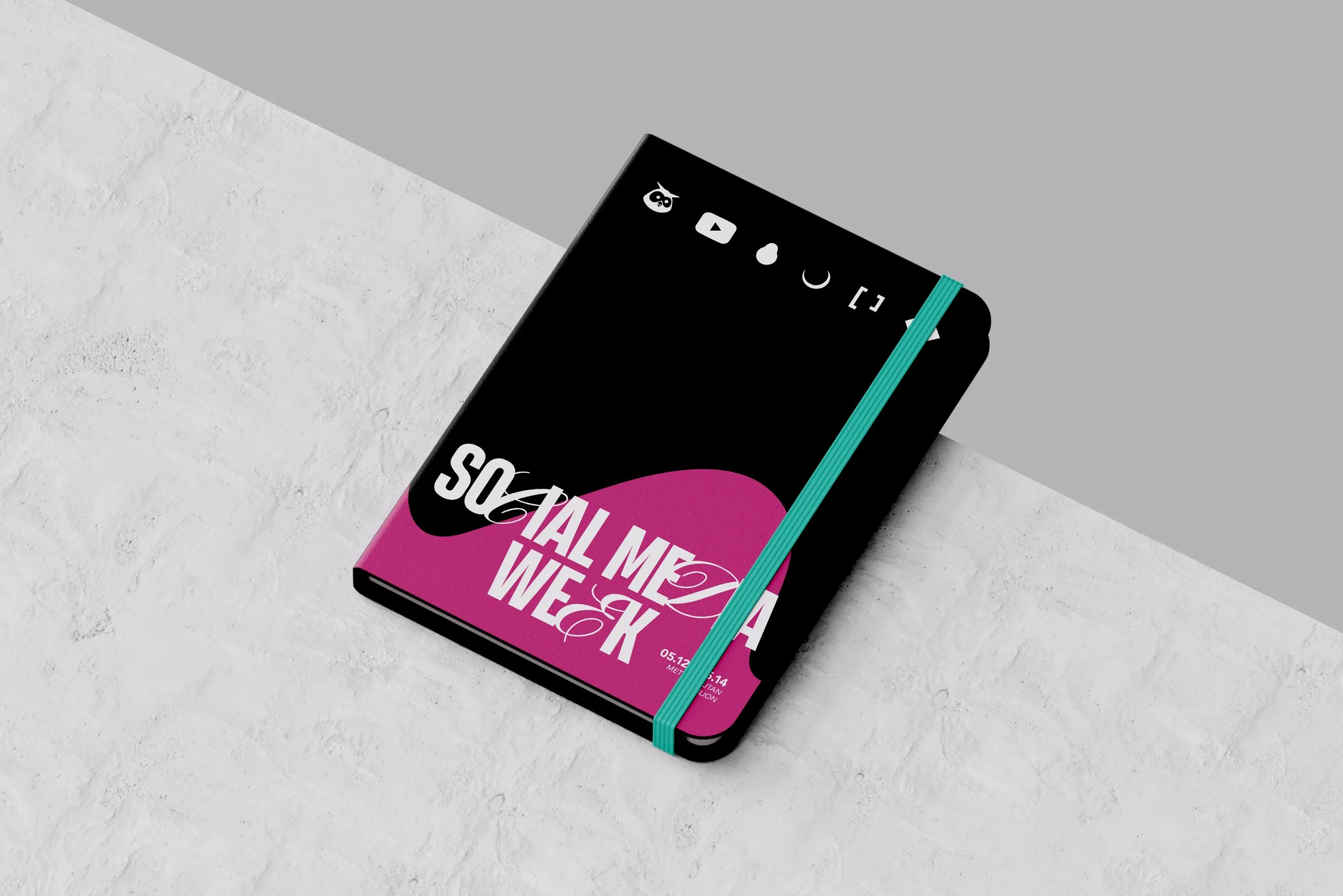
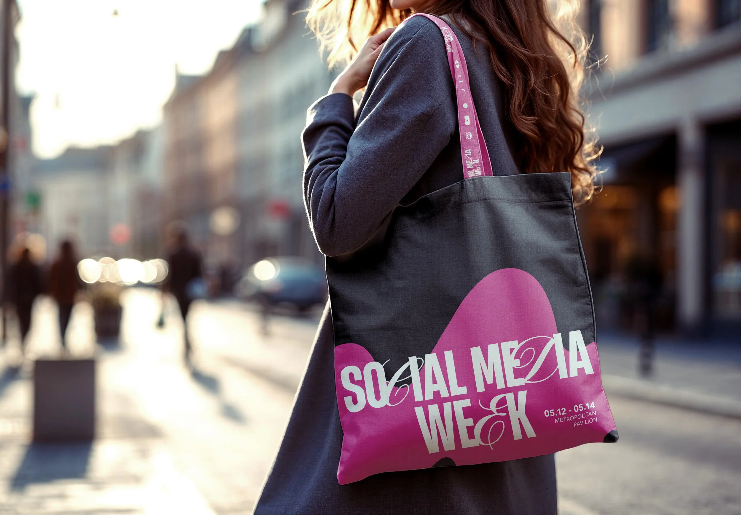
With a scroll-stopping color palette and platform-native design, Social Media Week delivered thumb-stopping impact across every feed.
Client
AD Week
Visual Identity, Campaign Development, Typography Design, & Key Art


Case Study:
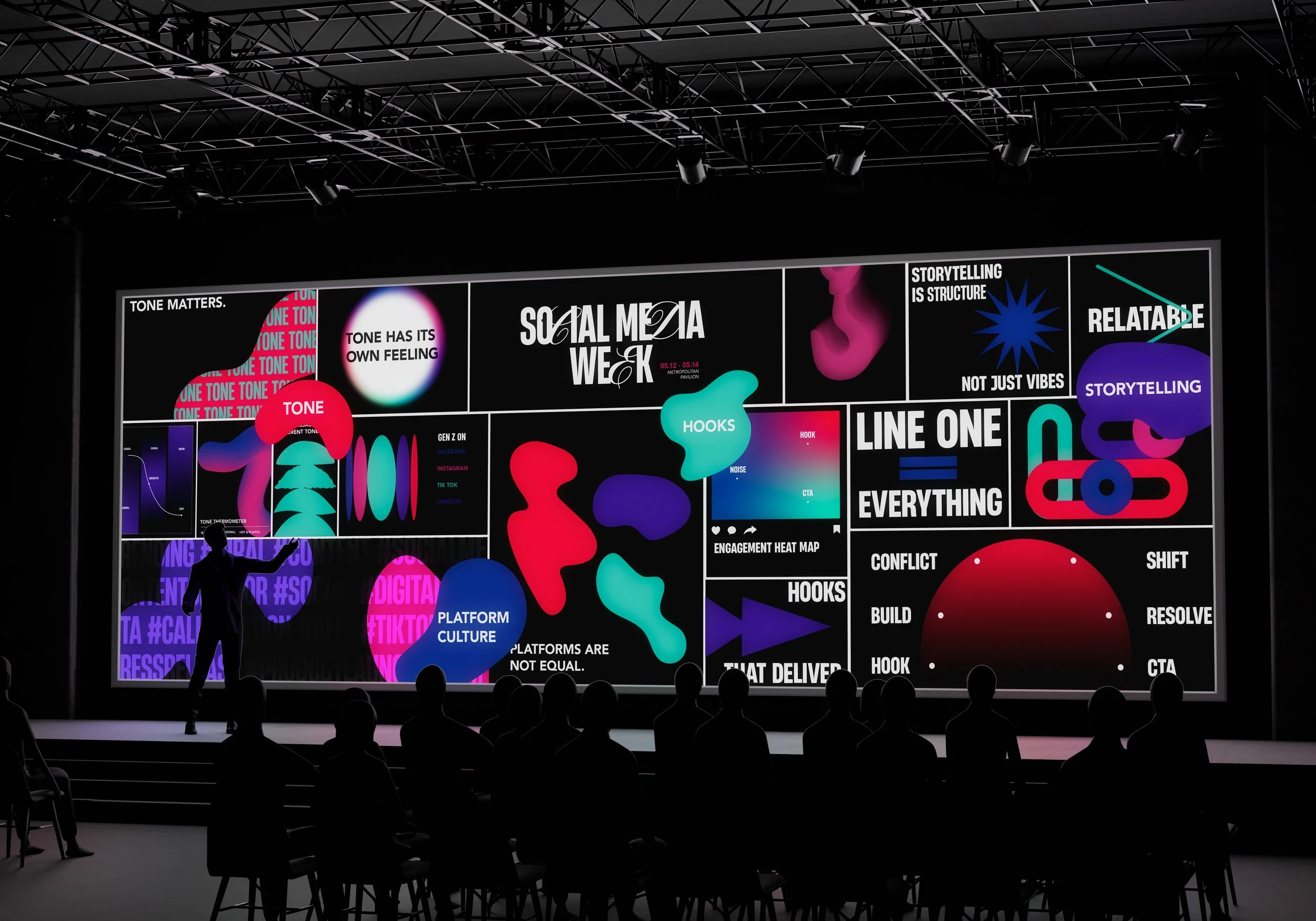
To reflect the bold, empowering spirit of Social Media Week, I created an integrated campaign that captured the event’s energy, innovation, and focus on the future of digital creativity.
At the heart of the campaign was a custom wordmark blending serif and sans serif typography, symbolizing the fusion of tradition and trend. A vibrant color palette and abstract shapes conveyed momentum and individuality, reinforcing the idea that no two creative journeys are alike,
yet all drive brand growth on social.
From digital graphics to event collateral, the campaign spoke directly to digital marketers, creative directors, and content creators aged 25–45. The branding energized audiences, built pre-event buzz, and visually echoed the dynamic conversations happening at the conference.